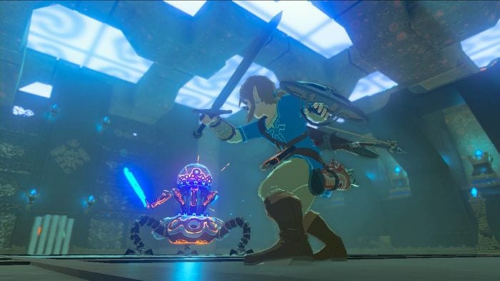
The Legend of Zelda: Breath of the Wild is both a new beast and chance at redemption for Nintendo. Not only is it the first game for the Switch, which is already meant to be a redemption story after the WiiU, it’s the series’ first attempt at a true open world and marks the return of a rather divisive direction for the franchise.
Breath of the Wild is also the first entry in the series on a non-portable system in 15 years to go back to a cel-shaded art style. While this style has been in many AAA games ranging from the Jet Set games to Crackdown and the Sly Cooper franchise (and more recently, Sony’s Gravity Rush 2), you generally see it mainly in more anime-styled titles such as Guilty Gear and Ni no Kuni. The last time Nintendo tried it with a Legend of Zelda entry was Spirit Tracks back in 2009 for the DS, but it gained notoriety for the series in particular with 2002’s Wind Waker.

While Wind Waker itself was regarded as a great entry in the series, the reception towards the art direction was (and still is) incredibly divisive. Many weren’t fans of the cartoonish look, which signified to them that Nintendo was shifting towards appealing to a younger audience while the competition of Microsoft and Sony focused on mature titles such as Halo and Killzone. The resulting chilled reception — especially in Japan, where the game’s art veers even more towards anime — is what led to Nintendo deciding that Wind Waker didn’t need a sequel and the art direction needed to veer more towards the realistic, something that Legend of Zelda: Twilight Princess was later criticized for.
Wind Waker’s art is a black mark that didn’t really leave the series until the HD version in 2013, but in the case of Breath of the Wild, it actually ends up being one of its best assets.
Breath of the Wild’s return to this style has been talked about at length by Nintendo, but its return has reasoning beyond just a change-up. Franchise director Eiji Aonuma has openly said that the HD version of Wind Waker led to the art direction for Breath of the Wild because of how it “captured the imagination” of the lead artists. The gouache and en plain air art direction creates a clear element for players, giving the oft-said phrase “if you see it, you can go to it” tangible meaning. Seeing each mountain far off in the distance gives the desire to travel there, and see what beauty awaits you.
What also doesn’t hurt is that it makes the game look gorgeous visually; this may be the best-looking Legend of Zelda title to date, especially on home consoles. The vibrancy of colors pops whether on your TV or on the tablet, and gives the game a storybook quality that its tale is aiming for. The characters and world convey more personality than they normally would, endearing them to the player with their incredibly expressive faces. Breath of the Wild’s art creation slogan is said to have been “refreshing and full-flavored,” and the studio clearly succeeded on that front.

A realistic art direction isn’t needed for a game or story to be mature. Darkness II had a similar art style while sporting constant, gory violence and a despondent plot. Even games without large amounts of violence can be a testament to this; Okami, a title said to be inspired by Zelda, was commended for its similar cel-shaded direction, and it was frequently cited by Ubisoft as an inspiration for their Prince of Persia reboot.
There’s a lot of destruction across Breath of the Wild’s iteration of Hyrule, sure, but the art style gives it a juxtaposition that feels meant to fuel your curiosity. Breath of the Wild makes this Hyrule a more warm and inviting land than previous entries like Twilight or Majora’s Mask, the latter of which was more concerned about showing you that this world was worth saving. But here, there’s a sense of warmth and loving, one that truly draws you in to explore all of its depths, just as the seas of Wind Waker 15 years ago made you wish to set sail and never look back. Even promotional pictures for the game convey this perfectly, with the box art in particular almost looking like something out of a National Geographic album.
So many games these days go for the hyper-realistic look, as Horizon Zero Dawn and the upcoming Injustice 2 have shown us. Nothing wrong with that, but it’s nice to mix things up visually. Breath of the Wild’s art style has clearly struck a chord with people, if the screenshots of the epic views are anything to go by. It can’t be a coincidence that the only two Legend of Zelda games to come with a photo mode are both it and Wind Waker, and it’s led to some pretty hilarious and captivating photos. Should Nintendo take anything to heart from Wild’s resounding success, it’s that there’s nothing wrong with getting cartoony.
