Beautiful Graphics That Couldn’t Save a Game
The Order 1886
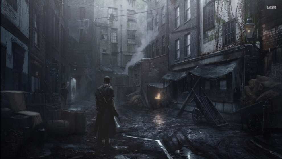
If you’ve played The Order 1886, then you know that it plays and looks like a movie. The entire game is in a wide-screen format and its motion-capture is top-notch.
Each movement, each bullet shooting from a gun, each flicker of a flame feels individually articulated and created with the intent that it would be seen. Even the most mundane things, like the way a piece of wood splinters off a plank, look like someone was specifically assigned the job of creating it.
Every stage demo and trailer shown before The Order 1886’s release demonstrated just how pretty this game was, but when the final product was released, everything but the visuals were lambasted by critics far and wide.
The story was predictable and paced poorly. The characters were one-dimensional. The gameplay was boring and void of the same care the game’s visuals received. It was almost as if Ready at Dawn focused more on creating a beautiful engine for games than an actual game.
Hopefully, one day a sequel fixes that.
Beautiful Graphics That Couldn’t Save a Game
Star Wars Battlefront II
Everything EA said about Star War Battlefront II sounded perfect: a brand new story in the Star Wars universe told from the perspective of the Empire, improved multiplayer and actual space combat. Above all of this, though, Star Wars Battlefront II looked like a Star Wars movie that you could actually play. From the characters to the environments to the set pieces —this game solidified itself as one of this generation’s prettiest games.
All of this was too good to be true, though.
Days leading up to the game, the now-infamous loot box controversy happened, certainly dampening sales. On top of that, this brand new story from the perspective of the Empire only lasted a few hours total, with less than half of the campaign spent as an Empire soldier —in the most predictable fashion, your character, Iden Versio, switched sides and became a rebel.
Furthermore, the multiplayer still contained all of the mistakes of 2015’s Star Wars Battlefront (and we still don’t have a Conquest mode damnit!). Despite how pretty this game was, it failed to be a great, or even good, game.
Beautiful Graphics That Couldn’t Save a Game
Lightning Returns: Final Fantasy XIII
Just like Final Fantasy XIII and Final Fantasy XIII-2, Lightning Returns: Final Fantasy XIII was gorgeous. The world was fully realized in an art aesthetic reminiscent of Final Fantasy VII.
Lightning looked more lifelike than ever before and the combat was buttery smooth. This was, at the time, the prettiest polygonal Final Fantasy game ever made.
Aside from the combat and visuals though, this game was a disappointing end to the Final Fantasy XIII trilogy. Sure, it wrapped up the story of three games, but it ended up being predictable and worse, ignored some of the rules and canon of the previous two entries to make the ending happen.
It was also bogged down by hiccups left and right such as dropped frames, with the game even coming to a complete halt occasionally. For a threequel, this game really should have had more polish.
Beautiful Graphics That Couldn’t Save a Game
Beyond: Two Souls
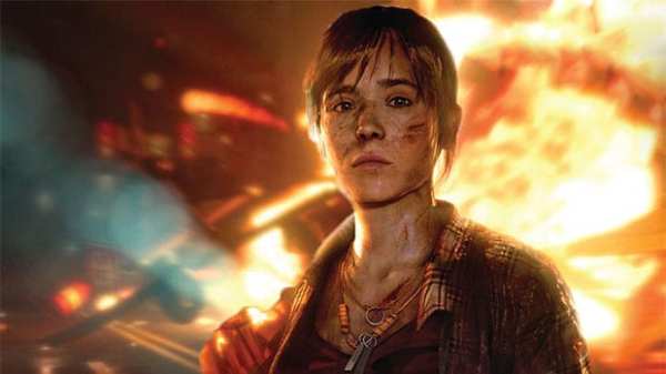
When it released, Beyond: Two Souls featured some of the most impressive motion-capture work at the time, with William Dafoe and Ellen Page’s characters appearing virtually indistinguishable from the actors themselves. If you pop the game in today, it’s sure to impress you all these years later.
These visuals couldn’t save the incoherent mess that Beyond: Two Souls was, unfortunately. The story was told non-chronologically for… reasons. When the game came to PS4, Quantic Dream even included the option to play the game in chronological order, an admission of guilt to the original release’s poor story structure.
Even when played chronologically, though, the game just isn’t great. It’s cringy, overly dramatic and, unlike other Quantic Dream games, fails to tell a story that players can empathize with.
Beautiful Graphics That Couldn’t Save a Game
Agony
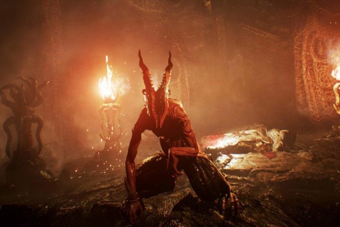
Simply put, Agony is a terrible, terrible game, but behind all of the bad is a hellish landscape that captures dread and death better than any game before it.
While the story, which sees your character attempting to get through Hell after arriving with no recollection of why, only grows worse and worse as the game treads on, the visuals continue to exemplify just how dark, grim and well-realized Hell can look in a video game. It truly feels like you’re in Hell in Agony.
Sadly, the visuals alone don’t accomplish that. With frustratingly bad gameplay and a multitude of bugs, playing through Agony feels like Hell too.
Beautiful Graphics That Couldn’t Save a Game
Mirror’s Edge: Catalyst
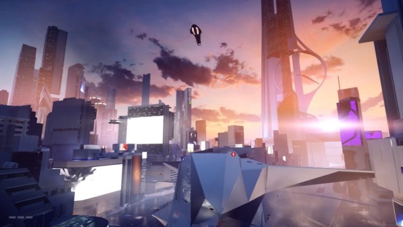
Mirror’s Edge: Catalyst could stand to serve as the prettiest game this generation. Sure, Mirror’s Edge: Catalyst isn’t the prettiest by conventional standards, but the art direction of this series is one of the smartest, sleekest styles in any video game ever.
It isn’t busy. In fact, it’s minimalist. Its colors are muted in such a way that the colors that do pop mean something, such as “you can climb here” or “don’t come here.” Its art direction tells a story in itself, the story of how to play the game.
With all of that said, it’s a shame the game dropped the ball in every other way. The story was simple and hampered by the fact that it was a prequel. The missions were repetitive and boring. The characters were one-sided and never felt fleshed out beyond a few story beats.
Overall, in all ways other than visually, Mirror’s Edge: Catalyst failed to capture the greatness the original Mirror’s Edge instilled in the parkour hearts of players around the world last console generation.
Beautiful Graphics That Couldn’t Save a Game
Assassin’s Creed Unity
When a bug isn’t ruining a key moment in the game, Assassin’s Creed Unity looks like a painting. Assassin’s Creed Unity’s France is fully-realized and alive, with more characters in the streets than ever before. The interiors of buildings are worthy of HGTV and the parkour and combat animations were buttery smooth.
The bugs did all they could to ruin these visuals, though, and even after fixing some of the bugs, Assassin’s Creed Unity still had flaws that held it back in the franchise: an exorbitant amount of chests to find (and I won’t even touch on the microtransactions associated with them), a desire to replicate Ezio with its main character, and a terrible modern-day story.
Beautiful Graphics That Couldn’t Save a Game
Ryse: Son of Rome
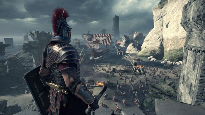
A launch title for the Xbox One, Ryse: Son of Rome served as an excellent example of what the power of this new console generation was capable of: lifelike details, fluid animations and more characters onscreen than ever before. On these fronts, Ryse: Son of Rome truly excelled. The way the blood dripped out of a wound was truly mind-blowing at the time.
But, in a game centered around almost exclusively combat, the combat, despite how stunningly realistic it looked, quickly became repetitive. The predictable story didn’t help, either. Beyond visuals, this game didn’t really do anything to warrant a sequel which is probably why Ryse: Son of Rome 2 is nonexistent today.
Beautiful Graphics That Couldn’t Save a Game
Disney Infinity
Disney is a company whose properties each come with their own art style. So when it was announced that Disney Infinity would be a game bringing all of these beloved characters into the same world, the first question on everyone’s mind was “How?”
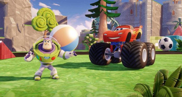
How would Disney put Cars and Toy Story on screen at the same time without it looking just wrong or out of place? Well, the answer was the art style they chose.
Uniquely Disney, the Disney Infinity visuals somehow put Lightning McQueen and Buzz Lightyear in the same world together in a way that made it seem like these characters had always lived in the same world. No matter how crazy the combinations of characters or the setting, it always looked right.
Disney Infinity wasn’t really a bad game on any fronts. It continued to get better and better —it was the toys-to-life counterpart that brought this series to its end. Simply put, the market wasn’t there anymore and Disney saw that, which brought about the swift end of Disney Infinity in 2016.
Beautiful Games That Couldn’t Save a Game
Knack
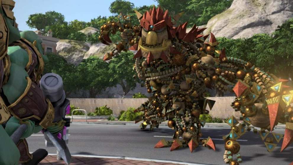
Would you just look at that big sexy monstrosity? With more voxels and pixels than any human can count, it is known fact that Knack, the lord and savior of PlayStation, is the most beautiful video game character of all-time.
It’s a shame that the architect of the PS4, Mark Cerny, the man behind this heavenly creature, couldn’t create a game worthy of Knack’s greatness. Instead of the fun, adventurous platformer the marketing for Knack promised, we were instead given a repetitive game void of the challenge that makes platformers what they are.
While the sequel certainly improved on the original by adding more variety and challenge, it didn’t fix everything. That’s okay, though.
One day Knack, you’ll get the world, the combat, the story and the cast you deserve.

