It’ll always be impressive to see the newest hyper-realistic visuals in games year after year. But what about those art styles that stray from the norm? They’re equally as, if not more, impressive than any direction that goes for straight realism. And they deserve to be celebrated, so here are 10 eye-popping video game art styles we’ll never forget.
Ori and the Will of the Wisps
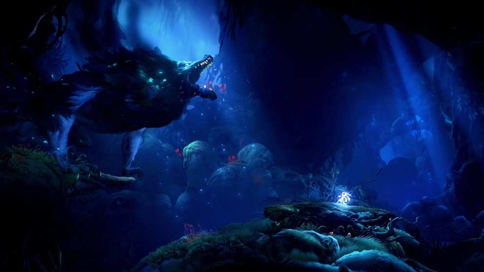
Ori and the Will of the Wisps is one of the most visually stunning games in recent memory. It won Twinfinite’s Best Art Direction award for 2020, and deservedly so.
This game is just full of wallpaper-worthy scenery from start to finish. Every single area looks like a painting in motion, from snowy mountaintops to dense forests, and plenty more.
Ori’s platforming is a joy to experience, but honestly, its vibrant 2.5D art style is reason enough to give the game a shot.
Transistor
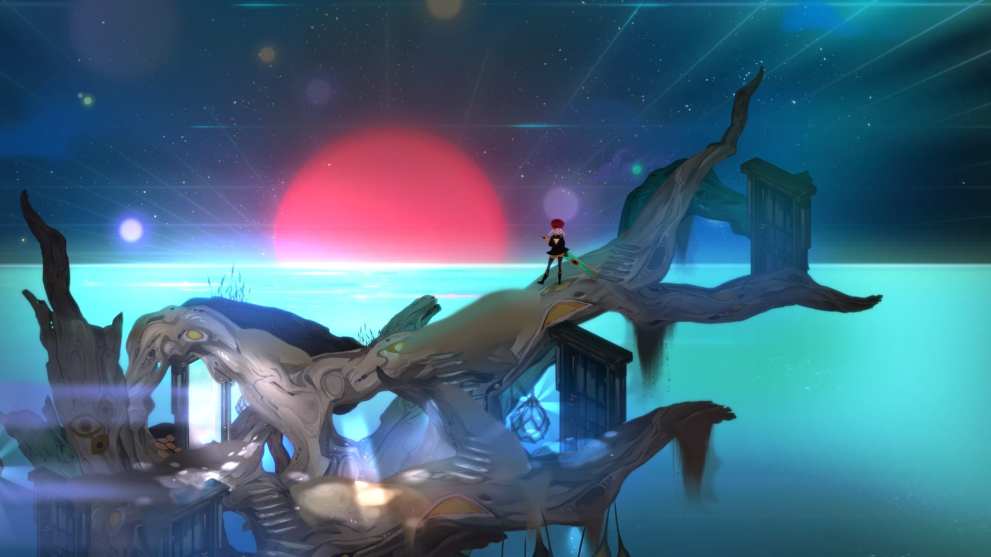
Supermassive’s games never seem to fail in the art department, and that’s thanks in large part to Art Director Jen Zee, who has created illustrations for Bastion, Transistor, Pyre, and Hades.
Hades was a huge hit last year, but if we’re focusing on eye-popping art styles, Transistor has it beat by just a bit.
It might be an unexpected choice to end off the list, but its futuristic visuals are memorable for a few reasons. The city of Cloudbank feels connected and recently lived-in, even though you explore it after disaster strikes for its residents.
Transistor uses eye-catching effects, softly glowing lighting, and fantastic background art to suck you into its world with every location that you explore.
Return of the Obra Dinn

Return of the Obra Dinn is another game that could be recommended based on its visuals alone, even though it’s already a solid game that has players solve a murder mystery on a ghost ship.
The art style is so unique that it’s almost indescribable, as its black and whites pop like something out of an Instagram filter. It’s far easier to show a screenshot or a trailer to get the point across on this one.
The game won the award for Best Art Direction at The Game Awards in 2018, and one look at its two-toned, pixelated style will show you why.
Cuphead
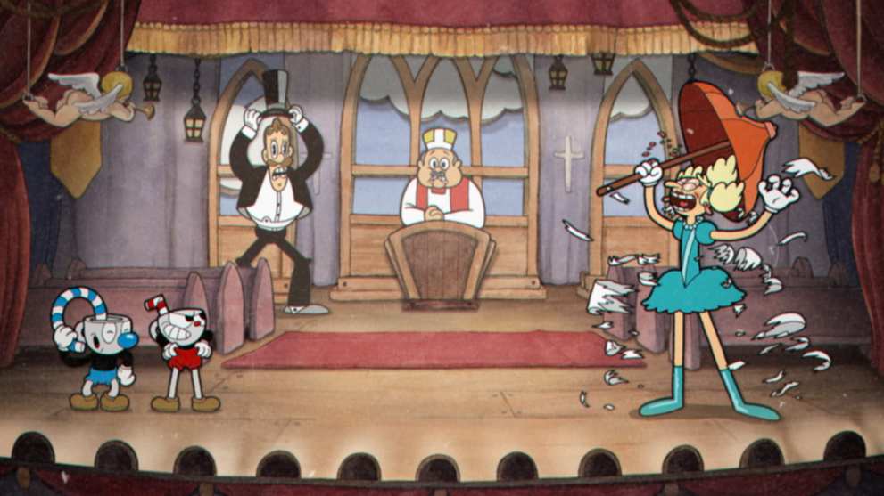
Cuphead is one of the more obvious choices for a list about eye-popping art styles, as its vivid and colorful drawlings literally pop off the screen. Alongside this, it also explored a unique period of time, transporting us back to the 1930s, but in an entirely different way.
Cuphead had players wanting more from the release of the very first trailer. Its hand-drawn cartoon art style is so uncommon that you’d be hard-pressed to find any game that looks even remotely the same.
The watercolor backgrounds and cel animation work wonders, even with all of the fast-paced platforming and shooting involved.
Octopath Traveler
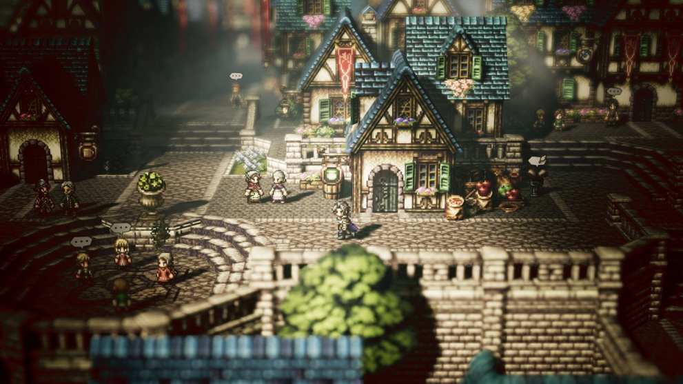
Speaking of pixelated, Octopath Traveler contains some of the most jaw-droppingly beautiful pixel-art in the industry.
Pixel art isn’t exactly a rare game art style in and of itself, but this game’s HD 3D backgrounds mesh so well with the 2D character sprites that you’ll want to take screenshots constantly.
The large variety of locations that you can travel to in Octopath’s world also help to sell the look, as simple things like bodies of water and snowstorms look far better than they have any right to.
White Night
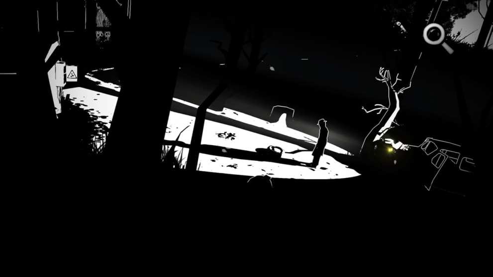
White Night isn’t exactly the most popular game on the list, but its stylistic choices are still undeniable. It’s a survival horror game with a striking black and white art style.
The art here sets the tone for the game, making the exploration of its 1930s mansion an all-around frightening experience. But it’s not just the monochrome visuals that make the style stand out.
It’s also the creative use of shadows, lighting, and silhouettes in a world without color. The game definitely wouldn’t have been the same without this special look.
The Unfinished Swan
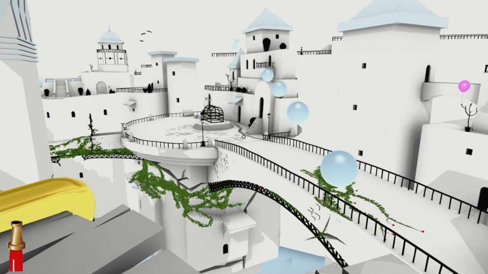
Every game on this list has an amazing art style, but The Unfinished Swan might have the most creative mix of gameplay and art of any of them.
The game has players using paint to reveal details in the world around them. The entirely white landscape contains no visible details or features whatsoever until paint gets splashed all over it.
As the world begins to reveal itself, the scenery becomes somewhat of a giant painting that’s just waiting to be explored.
INSIDE
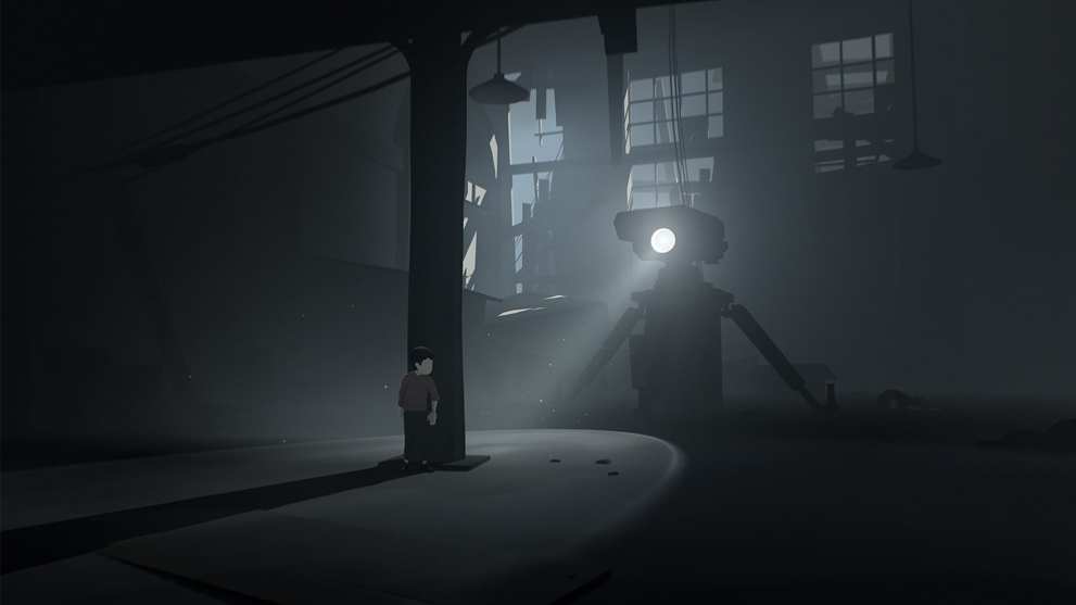
Truthfully, both of Playdead’s eerie puzzle platformers could be on this list. Limbo and INSIDE each have art styles that are worth mentioning here, but the latter manages to use more dynamic perspectives in more varied locations.
INSIDE is almost entirely devoid of color, save for the red shirt that the main character wears. This art style is so notable because of how it’s able to set a somber, mysterious atmosphere throughout the story without ever becoming stale.
There’s an underlying tension throughout that’s hard to explain with words, but the moody lighting and detailed backgrounds make it so that the game stays immersive 100% of the time.
Okami
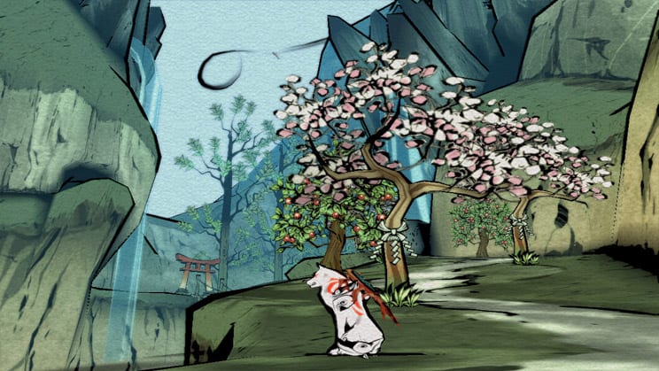
Okami is another no-brainer for this list. The game initially launched in 2006, and yet its art style still stands out to this day.
Its Japanese Sumi-e ink art is not only cool to look at, but it also serves a function gameplay-wise. Like The Unfinished Swan, Okami mixes art and gameplay in interesting ways.
Using player-made brush strokes to traverse the painted environment and attack enemies is something that needs to be experienced.
Paper Mario: The Origami King
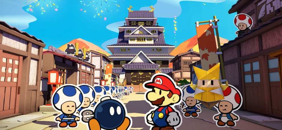
As a franchise, Paper Mario is already extremely creative when it comes to art design. It’s undeniable that Paper Mario: The Origami King pushes that creativity to the next level visually, no matter how you may feel about other aspects of the game.
The world is full of paper-based products that are waiting to be pulled, torn, peeled, and more. The environment never ceases to amaze, with paper mache enemies and confetti explosions being the norm.
Clever implementations of the paper art style can be found throughout the game, and they’re exactly what makes Paper Mario: The Origami King so unique.
