There have already been many anime titles that are either enhanced by CGI or ruined by it. They’re part of a topic that should not be taken lightly too, since more anime studios are switching over to full CGI productions due to its cost and workload-related benefits. What this means is that there might come a day when the world no longer understands, appreciates, or can even see newly produced gorgeous hand drawn 2D animation. Hopefully that will never happen, and the evidence for that is clear to see in these examples of 3D anime that fall flat compared to 2D anime.
Ghost in the Shell
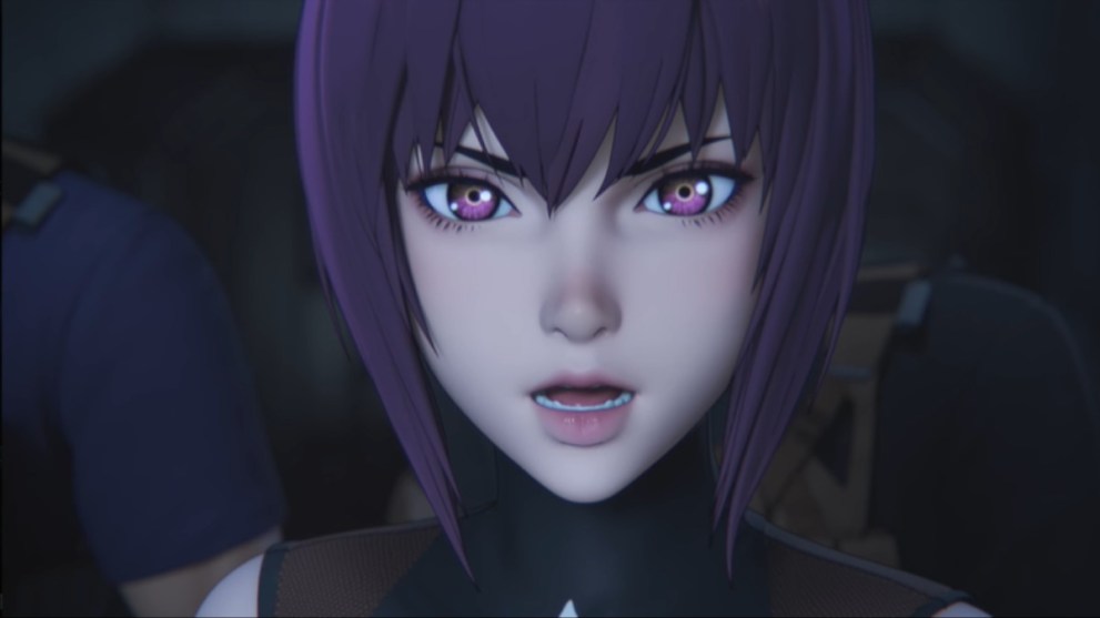
On paper, Ghost in the Shell should have worked with computer graphics since it’s based on cyborgs and androids, but it’s plain to see just how bad and disappointing the CGI series is with Ghost in Shell SAC_2045.
The action sequences actually suffered more due to unrealistic-looking movements, and the characters come off as badly-rendered dolls. It’s plain to see how stiff the characters moved, and this would not have been a problem if that was the intention. However, as seen in the original 2D movie, these cyborgs move fluidly, naturally, and powerfully.
Although Ghost in the Shell deserves to have more of an anime presence, it’s almost pointless to release a series that pales in comparison to what the original Ghost in the Shell movie strived to showcase. It should be synonymous with the beauty of hand-drawn animation fused with digital techniques, instead of allowing CGI to completely take over.
Kengan Ashura
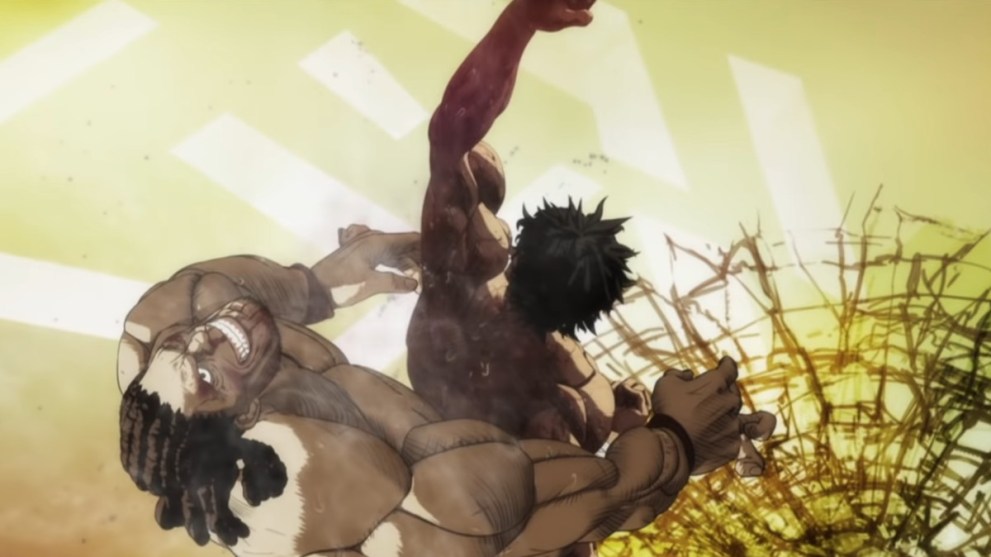
Kengan Ashura is an anime that was positioned to take full advantage of CGI, but the end result left a lot to be desired.
Since realistic movement is easily attainable in CGI animation, a fighting-centric series like this seemed like a perfect fit for the 3D animation style. And to be sure, Kengan Ashura received plenty of positive feedback from audiences for its segments which were focused entirely around combat.
As a total package though, it’s far from ideal. The art is still a far cry away from the gritty manga, and the cel-shaded characters look too clean and smooth while also having a robotic feel to their movements. This leaves the series feeling like an awkward mess with excellent fights sprinkled throughout its runtime, and ends up being a less than stellar example of what 3D CGI anime can accomplish.
Fist of the Blue Sky: Regenesis
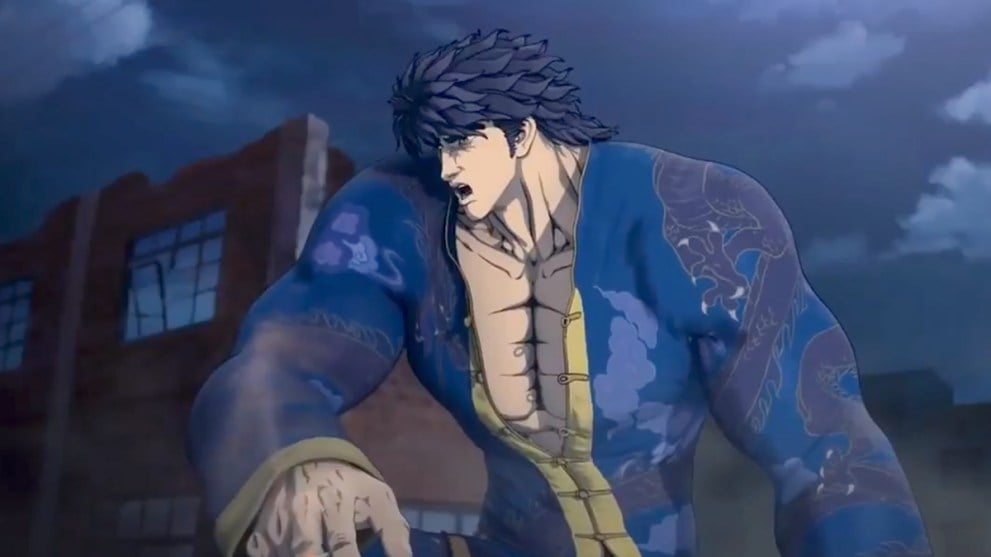
Fist of the North Star is a legendary anime and manga that deserves both an honorable legacy and a regular appearance in entertainment. This spin-off series was anything but those things.
Take a look at this screencap and open any page of the original manga; you will not find any panel with Kenshiro and his deformed hands or poorly proportioned body anywhere. Also, all it takes is one glance at this anime and then at the original Hokuto No Ken anime movie, and it’s easy to see how they look nothing alike. It’s seemingly impossible for CGI to capture the organic style and imperfect details that define hand-drawn anime. More on this in the Berserk entry later, but Regenesis suffers from the same art style deficiency as Berserk.
Also, similar to Kengan Ashura, Regenesis attempted to take advantage of accurate CGI movement for the fighting sequences. Unfortunately, this translated into stale fights that were made out to be extreme but lacked the characteristic flash and bombast of the manga that were perfectly portrayed in 2D style.
Berserk
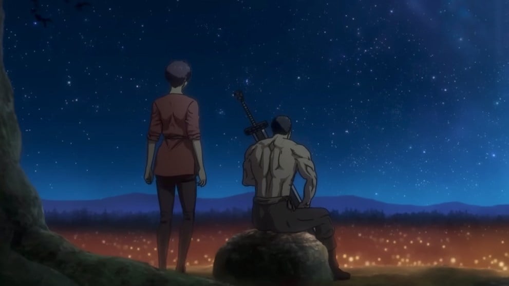
The original Berserk anime is a prime example of what traditional only anime is capable of.
It’s not without its flaws, but the art style and animation perfectly captured the aesthetics and themes of the Berserk manga and story. The art style featured sketched and hashed line art along with emotionally illustrated stills, and gritty hand-drawn art.
When the continuation kicked off in 2017 with full CGI art, it instantly proved how the CGI aesthetic ruined the feel and tone of the anime. The movement of most every character felt unnatural or stilted, with even the action coming off as an odd dance of computer generated models trying to imitate real life. And while they tried to copy the art style, the flickering line art looked annoyingly forced and distracting on the 3D character models. The cleaner and brighter style can accommodate other anime, but with Berserk, a more organic and rough hand-drawn style better suits the series’ mood and themes.
Dragon’s Dogma

Dragon’s Dogma is another anime with lackluster 3D CGI animation, though it stands as a special kind of terrible among its contemporaries.
The peculiar issue with this title is that it started out as a video game published by Capcom in 2012 and not a manga. Given its style was originally designed within a largely 3D medium and in a 3D style, it seemed natural to use CGI and create a cel-shaded style for its animated series.
Sadly, the result was a complete failure that looked like an older Cel-shaded game. In the same way that Berserk displeased viewers with awkward moving characters and an art style that didn’t serve the gritty tone of the series, Dragon’s Dogma’s animation felt incongruous with what the series was known for and was host to characters which moved around like rickety puppets.
009 Re: Cyborg
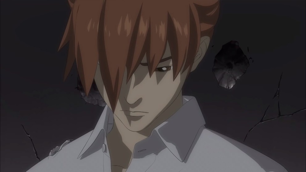
Another classic anime that fell short of its initial hype, 009 Re: Cyborg had plenty going for it.
The film served as a follow-up to a classic story about cyborgs that would be fitting for CGI animation, and had a relatively high-budget production that equated to stunning action sequences and landscapes. Sadly, it let down fans mostly due to how the CGI was far from perfect. Though the fighting sequences did benefit from dynamic 3D choreography, it came at the cost of looking like a video game cutscene that lacked an organically exaggerated interpretation.
The rest of the production had stuttering and choppy movements that proved to distract many viewers, and left the film feeling like an imperfect follow-up to the beloved series.
Knights of Sidonia
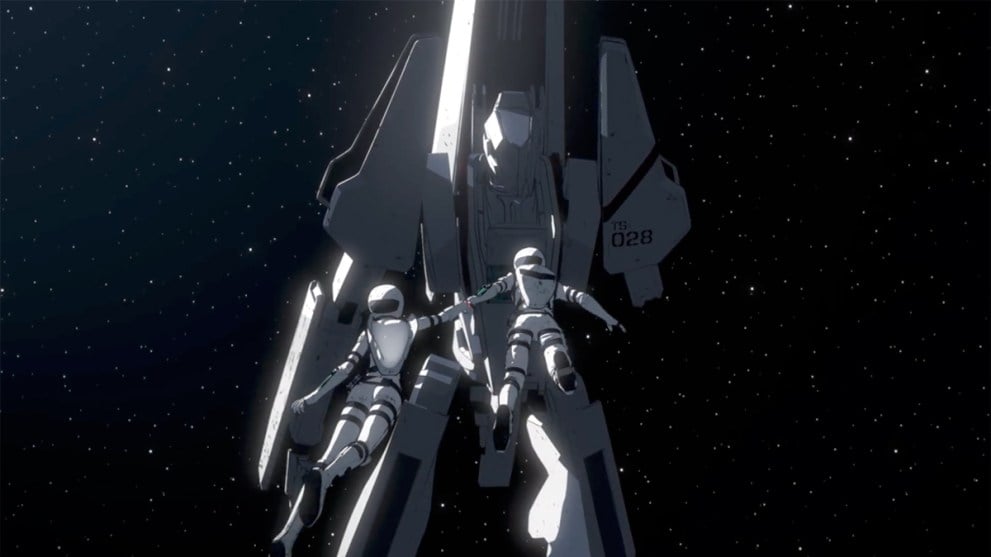
Knights of Sidonia is a special case among the shows on this list, as it’s not an entirely terrible 3D CGI anime.
Mecha and giant robots are an important genre to anime, and all of the legendary classics created beautiful and technically detailed anime with only hand drawn art. And yet, in 3D CGI, the robots and vehicles are acceptable because they are meant to look like machines or cyborgs and androids, which are all either inorganic or part-robot (which is not inherently natural). This means that if the characters are still hand-drawn, a beautiful balance of cel and CGI animation is possible.
But as seen in Knights of Sidonia, the mecha looked great in CGI, while the 3D characters ended up looking just as soulless and robotic as their machine counterparts. The irony is that the characters move with the same stiffness and jerkiness that the mechs do. And finally, the character art appears to look like the typical cel-shaded CGI seen in video games, but there’s an odd aesthetic to how they look unappealingly in-between 3D CGI And 2D hand-drawn anime.
Kingdom
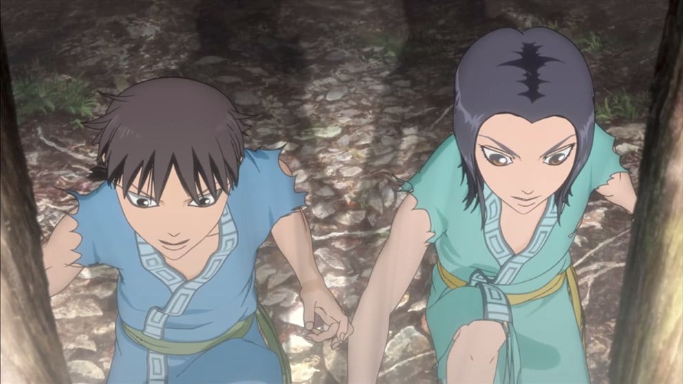
Kingdom is an epic-scaled story that looked horrible in 3D and suffered from bad character movement, and as a result, was switched over to 2D animation for the third season and looks immensely better.
There’s not much else to say that isn’t painfully obvious from the moment anyone takes a look at the manga and then starts watching the CGI animation. The characters have strange bulging eyes, and the art style looks horribly plain with jittery movements that are distracting.
As epic as the war scenes could have been, they were ruined by bland CGI models that moved too robotically and broke the immersion. Fortunately, fans were overwhelmingly happy when their favorite series became 2D hand-drawn and only expressed sorrow over how the series should have been that way from the start.
EX-ARM
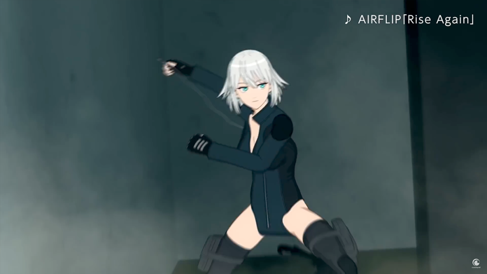
EX-ARM is infamous for being one of the worst 3D CGI anime out there, and it’s not hard to see why.
The show was produced with full CGI which looked ridiculous and ended up being one of the lowest-rated anime shows in history. The trailer on Crunchyroll’s Youtube Channel is overflowing with hilarious comments that sarcastically prove how the CGI animation failed this series. The reason this series failed so miserably is that the CGI was low quality and looked like a CGI video game from the early 2000s. Characters looked like hobbled-together models and they moved in a choppy manner that looked unrealistic and non-stylish.
Those are 10 3D anime that fall flat compared to 2D anime and serve as a reminder that CGI should be carefully integrated alongside traditional hand drawn anime. Feel free to leave a comment if you know of any other shows that would make this hall of shame, and check out some of our other anime-related content down below.
