THE TOWN OF LIGHT ON PLAYSTATION 4
At first glance, The Town of Light looks like every other first person horror game, with its creepy mental asylum setting, dark themes, and focus on exploration. However, it is far closer to ‘walking simulators’ such as Gone Home and What Remains of Edith Finch in terms of presentation and its story is far more distressing and shocking than it is ever scary.
As Renee, you return to an abandoned asylum in Volterra, Italy where you spent the majority of your early adult years. Renee doesn’t have much recollection of the events that unfolded there so, through exploration of the asylum and the surrounding areas, her memories return, telling of the terrible ordeal that she suffered there. Certain rooms will trigger flashbacks of abuse, old documents will uncover what happened to other patients, and other items will unearth the general malpractice that occurred within 1940s asylums. It’s a dark story that deals with some upsetting themes, all of which are based on reality. There’re moments that cover child abuse, sexual abuse, neglect, and mental illness, all of which are dealt with respectfully and informatively.
As we learn more about Renee’s life and the situation at the asylum becomes more clear, the events get more emotional. There are doctors who cut ties with outside family members, and horrible surgical practices are investigated. Renee is an interesting character and her story of her ordeal, and the general history of World War II insane asylums, is fascinating. The Town of Light’s story is both its focus and its undeniable highlight, but it is consistently let down by its presentation and design choices.

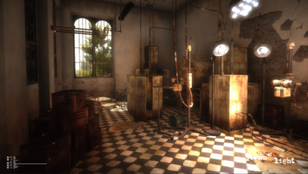
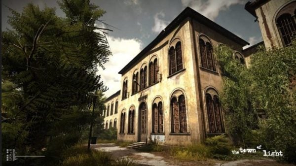
The Town of Light originally released for PC in early 2016 but its visuals have been upgraded for the console release. However, developer LKA’s game’s graphical fidelity suffers from the style of game it is. While The Town of Light is striving for realism in its setting, its slow movement and environmental storytelling put a lot of focus on its flaws. The textures, in the outside areas in particular, are murky and pop-in is almost constant and can occur with objects meters from you. Inside the asylum, the detail of the cracked paint on the walls and the scattered belongings of former inmates make things look better but nothing ever stands out. The flashback scenes, however, are where some of the game’s ugliest moments come to light. People, whether they are doctors or patients, look almost cartoonish; whether that is intentional or not is unclear but they move robotically and look out of place in the realistic environments. One dramatic scene in particular, portraying sexual abuse in the asylum’s showers, features what looks like two mannequins. It is distracting and takes away from the meaningful effectiveness of the scene. It is far from a terrible looking game, but since the setting is so important in developing The Town of Light’s atmosphere, it is constantly under the spotlight and it doesn’t always hold up to that scrutiny.
The presentation of The Town of Light’s story can also be frustrating due to some odd design choices. Firstly, movement itself is a chore. You move slowly through the corridors, and even slower when trying to turn. You have to ensure that you are looking straight ahead when moving because any off-center movement makes you walk even slower. It almost forces you to walk in imaginary grids on the ground due to how inflexible the movement is. You get used to it after a while, but it completely negates any desire to explore. The game also refuses to give you freedom of the setting. Whole wards of the asylum, certain rooms, and entire areas of the grounds are off limits at certain points of the game until you finish the moment in the story that unlocks the right door. In the game’s early chapters you’re given little more than two small corridors to explore, hiding the scale of what happened there in the 1940s.

Player choice plays a huge part in how Renee’s story plays out. When reading doctor’s notes, letters home from the staff, or reliving upsetting moments, you may have to choose from up to four answers when seemingly having a conversation with another voice in Renee’s head. When you answer, a symbol displaying one person and an arrow to a group of other people is shown. Sometimes one or the other will have a large red cross through them, hinting at some effect on how the story is to play out. However, what each symbol means is never explained and the answers are often too similar in tone and sentiment to discern any substantial difference. There is no way of knowing how your actions are effecting the story or what you could have done differently to change the outcome. The poor voice acting doesn’t help either. While the tone usually represents that of a mentally unstable patient, no sentence, or sometimes even clauses in a sentence, sounds connected. No line runs smoothly into another so it is often difficult to understand what feeling the speech is attempting to promote. That issue also adds to the problem of muddled storytelling in the game’s middle chapters.
The Town of Light improves in the final five chapters, however, as it opens up, speeds up the pace of the story telling, and you become comfortable with all the technical and design shortcomings. It depends on how your story plays out but Renee’s mentality changes drastically and the story explores extremely dark themes including lobotomy and electric shock therapy in unique and original ways, without diminishing the horror of them. You’re given the freedom of the entire grounds and the pace of the plot makes it far easier to follow.
Sticking with The Town of Light’s slow, meandering storytelling and linear exploration in the early chapters does pay off eventually, but if the dark and often distressing tale of Renee and the happenings in World War II era insane asylums doesn’t interest you, there is very little to see that wouldn’t be even more of a turn off.
Score: 2.5/5 – Poor
Pros
| Cons
|
